Tips and tricks on how to do an interactive visualization from the epic battle of Kaggle challenge participants
If you’re a data enthusiast, as you dive into the world of data visualization tools, you’ll probably encounter python’s Bokeh library. Bokeh provides a great deal of interactivity while one can still code in their familiar python environment. In this post, I’ll showcase Bokeh’s fundamental tools with my latest project: a dashboard from a Kaggle challenge leaderboard. Follow me, this blog post could be a good reference to anyone interested in creating a similar project and taking advantage of Bokeh’s awesome interactive data visualization tools.
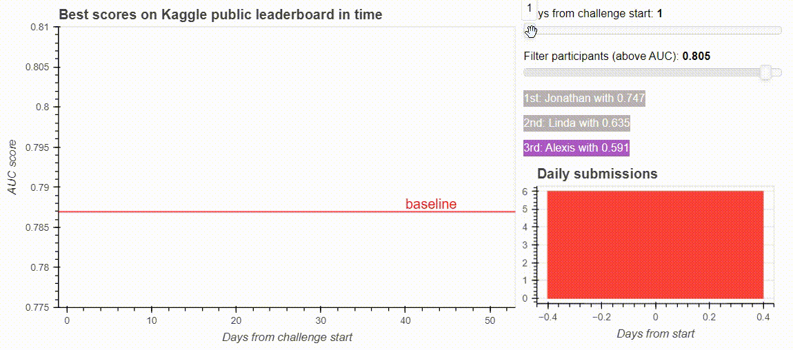
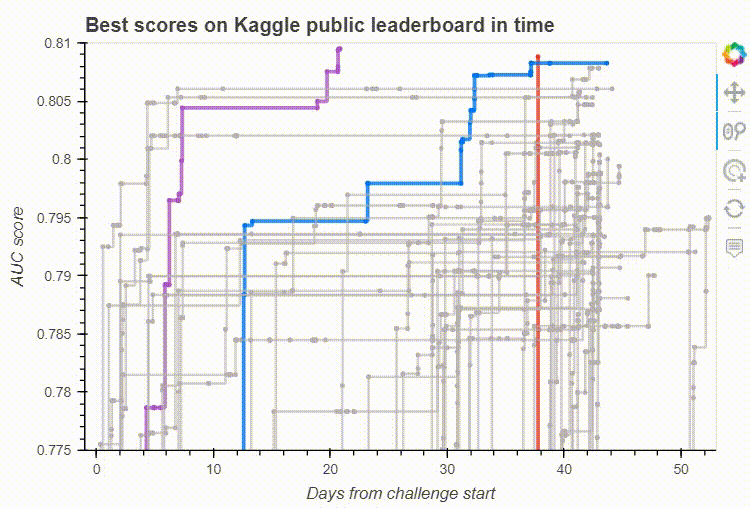
The dashboard from the Kaggle challenge leaderboard. Image by the author.
Motivation
Kaggle is a platform for data scientists and students to test their algorithms and knowledge to solve various challenges. As a co-instructor of a data-science course at Budapest University of Technology and Economics, I’m thrilled to see how my students cope with a machine learning challenge in an in-class Kaggle competition. As our yearly in-class challenge emerged to be an interesting battle, we were interested in how the number of daily submissions and the dynamics of the leaderboard changed in time. This gave me great motivation to make an interactive dashboard from the leaderboard.
The Bokeh library
Among data visualization tools, there are several options to choose from creating a dashboard. I got to know about the Bokeh python library a few months ago and chose it for this project, as it provides a good platform to create interactive and customizable visualizations. It is easy to embed plots generated from Bokeh to a website, as it can generate HTML pages and it’s also easy to create a bokeh application. For more motivation to use Bokeh, just check the demo dashboards.
The first trick is in the data preparation
Kaggle allows challenge owners to download all of the submissions with their public and private scores. I wrote a script that goes through the downloaded folder structure and collects this information to a pandas dataframe (You might need different code in case of different challenges, but of course, I can publish mine upon request 🙂 ). You can find the collected data and all of the code presented in this post in the project’s Github repository.
We have the following information for every submission:
- name: the name of the participant (I changed the actual names to random names)
- days_from_start: the time when the submission was uploaded, measured from the start of the challenge
- auc: the public auc score of the submission
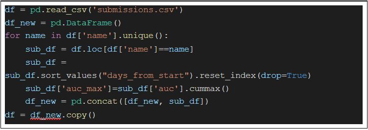
The first trick is in how I want to visualize the data. I only wanted to show those submissions for a participant, which are better than the previous ones. This can be done by sorting the submissions of a participant chronologically and using cummax from pandas to calculate the best solution to that time. I stored this best score in a new column called auc_max.
Another trick to make it easier to visualize submissions is to create a color column. Thus, I could sort the participants based on their maximal score and color the first three submissions differently. We will see soon that we can then set the scatterplot’s fill color easily with the color column name.
One can pass a pandas DataFrame directly to Bokeh’s visualization tools, but using Bokeh’s own ColumnDataSource object gives us access to more advanced options like one can share data between plots and widgets. Creating a ColumnDataSource is pretty simple from our dataframe.
![]()
Leaderboard visualisation
Now that we have a dataframe with everyone’s all-time best scores, let’s dive into Bokeh’s visualization tools. First, we create our virtual canvas the following way:
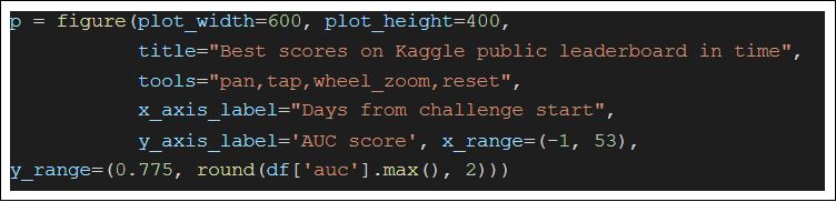
It’s awesome that even a simple graph has interactive features. By defining the tools parameter of the figure, we added them to our plot. For example, the pan tool allows us to move the graph within the plot, while wheel_zoom allows us to zoom in and out.
On my leaderboard, I want to visualize each participant’s submissions in time. That’s why our x-axis will be the days_from_start column, while the y-axis is the auc_max score. Then, making a scatterplot with each new all-time-best submission is just one line of code:

Here, the source of the plot is our dataframe converted to a ColumnDataSource, and we refer to the columns for this object in the x, y, legend_field, and color parameters.
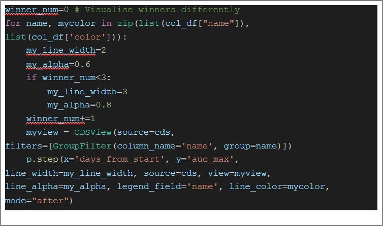
The next challenge is to connect the points on our graph representing a submission with lines. I want to draw a line for each participant to follow their progress along the line. For this, I needed to have subsets (by the name column) of my ColumnDataSource object. This can be done by Bokeh’s CDSView class, where we can filter the dataset for each participant. When I had the subsets, I connected the points with a step function. In the code below, you can see that I created a col_df object, which contains the participants sorted by their all-time maximum score. With this, I could visualize the winners of the challenge differently.
Now that we have the core of the dashboard, we can play around with Bokeh’s built-in interactive tools. Of course, it makes us want more interactivity, so let’s get it.
Bokeh’s built-in interactive tools on our leaderboard visualisation. Image by the author.
Adding more interactivity with hover tool and widgets
I wanted to mouse over the scatterplot and see some information about the dots representing submissions. This is the exact purpose of the HoverTool, which is simply two lines of code:
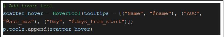
I could define the labels and values of the tooltip as a list of (label, value) tuples, where those starting with “@” are associated with columns in a ColumnDataSource.
The next thing I needed was to remove points for the plot with an interactive slider. I added two sliders: one for my x-axis, days_from_start to inspect how the battle of the participants evolve, another for filtering the participants based on their best score.
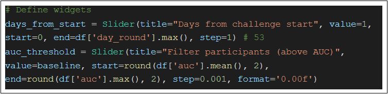
The most important takeaway is that each slider has a value that we can set by interacting with the slider. So we need a function that updates our plot, and filters the data. For me, this function is called update_data. For more details, you can check it out in the Github repo. What we need is to tell bokeh what to do when we interact with the slider:

That’s it! We have done the core part together. I also added a histogram to my dashboard to see the number of daily submissions in time. You can find it in the source code as well. Setting up the application is now easy as you only need to run a
bokeh serve –show your_bokeh_script.py in the command line, where your bokeh script is present.
Takeaways
First, I tried to create the scatterplot in a for loop by filtering the data by a participant’s name and creating different colored dots for everyone. What I found instructive, is that it can also be done much simpler by using a color column, and simply adding this column to the legend_field parameter.
It is also important to note that Bokeh has a line function as well, to draw a line between points. Unfortunately, it does not work with CDSView (the filtered subset of the data), so after I coped with it for a while, it was a relief to find the step function, which was working perfectly with subsets of data.
What I found amazing is that you can customize your plots to the smallest detail. I only showcased a few ones, like how to make a Slider show 3 digits of numbers, or how to visualize the winners of the challenge differently. Managing ColumnDataSource objects and using the CDSView tool to filter them might be tricky at the first sight, but they allow us to make plots from a simpler code and to share data among different plots.
I hope you found this blog post using Bokeh’s data visualization tools useful. If you have a similar project that needs to be solved, you can find me and my colleagues at dmlab, or for more details on this project, you can check out its GitHub repo. Any ideas on further improvements are welcome!
This article was originally issued on the official website of dmlab!