Debbie O’Brien speaker of Craft Conference 2022 is here to tell you everything about how to build an e-commerce product. Debbie is a Head Developer Advocate at Bit, speaker, writer, teacher, open-source contributor and surely someone who is going to be with us at Craft talking about the fact that it is all about the components.
Building an e-commerce Product details component
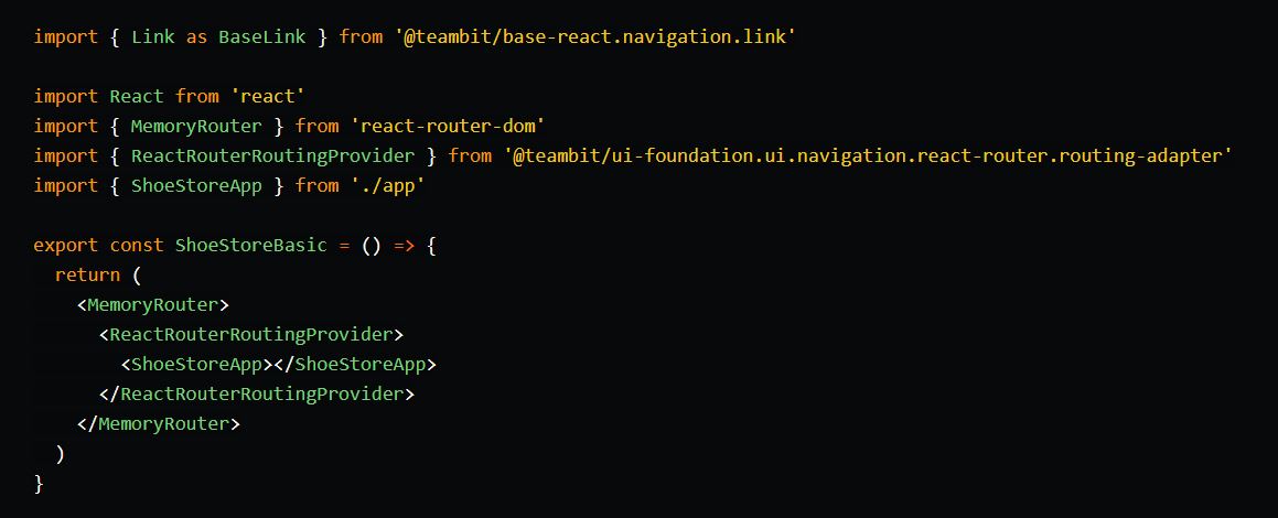
I started off with a basic demo of a shoe store that uses components from different scopes including the base-ui scope for base/design components and the e-commerce scope for components that are more e-commerce focused and therefore owned by the e-commerce team. Scopes are a collection of components and can have but do not need to have their own repository.
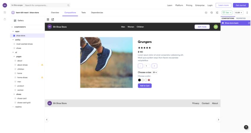
It was time to enhance the shoe store and add the detail page for when you click from the shoe’s product card. This page should give you more details of the product and allow you to choose what color and size you want as well as the quantity and finally have a call to action that will add the product to a cart. This page needs to be a dynamic page and render the correct product when clicked.
So where do we start?
 First of all we have a design that shows us what the page should look like. From this design we can break things up into components starting with the biggest component first which is the page component. Then we need to ask ourselves where does this page live? To which scope does it belong to or which team is responsible for it? As we are building a page in the shoe store it was pretty obvious that this page component should belong to the shoe-store scope.
Breaking down the Product Page
Now when we start breaking up the page into composable components we have 4 components that we need to create:
- the product details component
- the reviews component
- the featured products component
- the banner component.
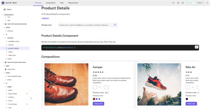
Product Details Component
For this component, we need to now break it down into smaller components and decide who each component belongs too, who should build and own these components and what their names should be. It is at this stage that we also check to see if we already have a component created that we can use or if we need to create a new component or perhaps even enhance an already created component.
Naming and Scopes
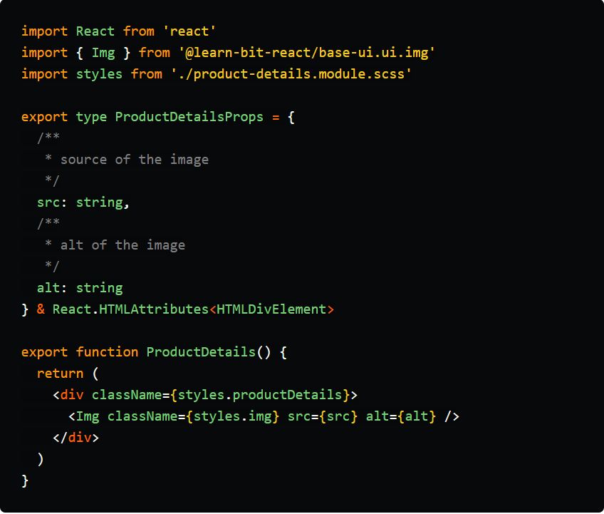
We decided that the product details component should be named ‘product-details’ and should be owned by the e-commerce team as this component can be used not just in the shoe store but also in any of the other stores.
API First
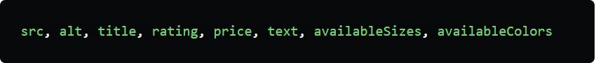
We then work out the props needed for this component which in our case is:
Listing out our Components
The components needed to create the product details component are:
- Img component from base-ui
- heading component from base-ui
- rating component from ecommerce (new)
- currency component from ecommerce
- text component from base-ui
- counter component from ecommerce (new)
- button component from base-ui
- input component from base-ui (new)
- select size component from ecommerce (new)
- select component from base-ui (new)
- available colors component from base-ui
- addToCart component from ecommerce (new)
- button component from base-ui
- shoes entity component
- product entity component
Once we have our components we need to start thinking about the api that we need to build for each of these components. What props do we need in order to build these components?
Thinking in APIs
The rating component needs props of rating. Does it need a stars prop? Or are all rating stars? These are decisions that we need to make in alignment with the product owner. It might not be necessary to build a rating component that does ratings for any type of ratings. Stars might be enough for this project. It can always be refactored later if needs be with a default of stars so no breaking changes take place.
What is important is to build what we need and not build for every single possible future need that may or may not happen. It is very easy to over architect a project and end up with a big mess that you have to deal with later. It is not always easy to only build what you need yet build in a way that can easily scale if and when you need to
Time to Build
Once we are clear on how we are going to build the component it is then possible to actually build it. There is no right or wrong way when it comes to building but I will share with you how I built it. Of course, I built this alone but if working with a team then certain members of the team might be building some of the components and then they can just be pieced together.
I also used Bit.dev to build my components but this is not essential to architecting your site and if you don’t want to have independent components you can still use this way of thinking to build no matter what framework or library you are using. However, the reason I use Bit is so I can build these components independently and in isolation from the other components. This makes me able to build, see and test the component in its own environment before using it in the more complex component. That way it can easily be re-used in other components as it is fully decoupled from any other component yet can have dependencies of other components if needed.
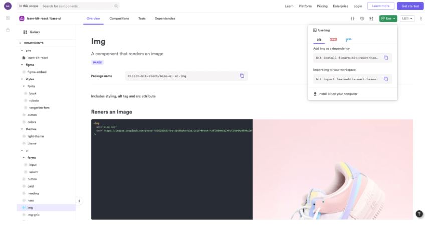
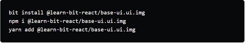
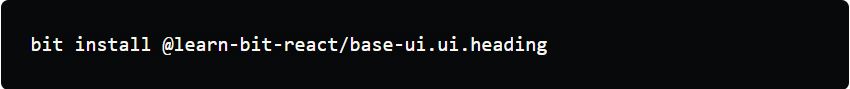
We start by building the product-details component in the ecommerce scope. The next component we need is the Image component and we already have one created in the base-ui scope so we can just go to that and install it into our project using bit, npm or yarn.
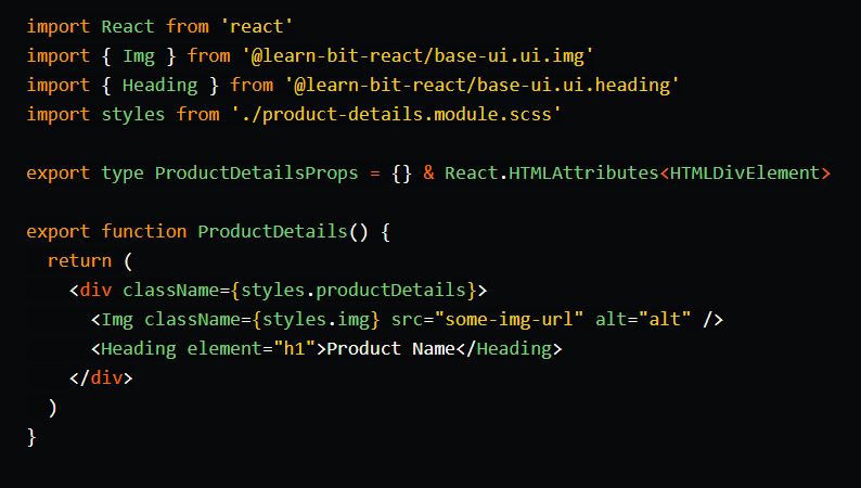
We then import the component and start composing our product details component.
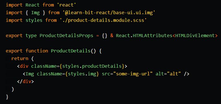
Building things with props
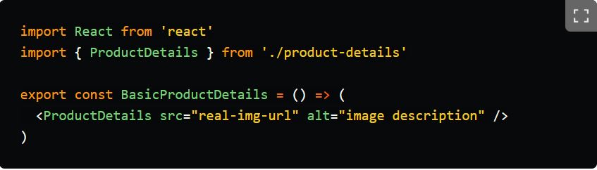
Now there are a few ways of doing things. You will notice I have just added a static src and alt into the image component. This just allows me to quickly see what I am doing. However it is also possible to directly use props here and start building out the composition file with the mock data. This is how we build things in Bit as the composition file is how we can see the component while running Bits dev server.
The composition file in Bit would look something like this.
Using mock data
If you have mock data already created as a separate entity component you could just go ahead and directly use that although I prefer to import the mock data component later and make sure it is first working with some basic mock data direct in the component.
And of course, we will have a lot of refactoring later with our api as really we just want to have a product and pass that as the prop rather than passing individual props. It should eventually look something more like this:
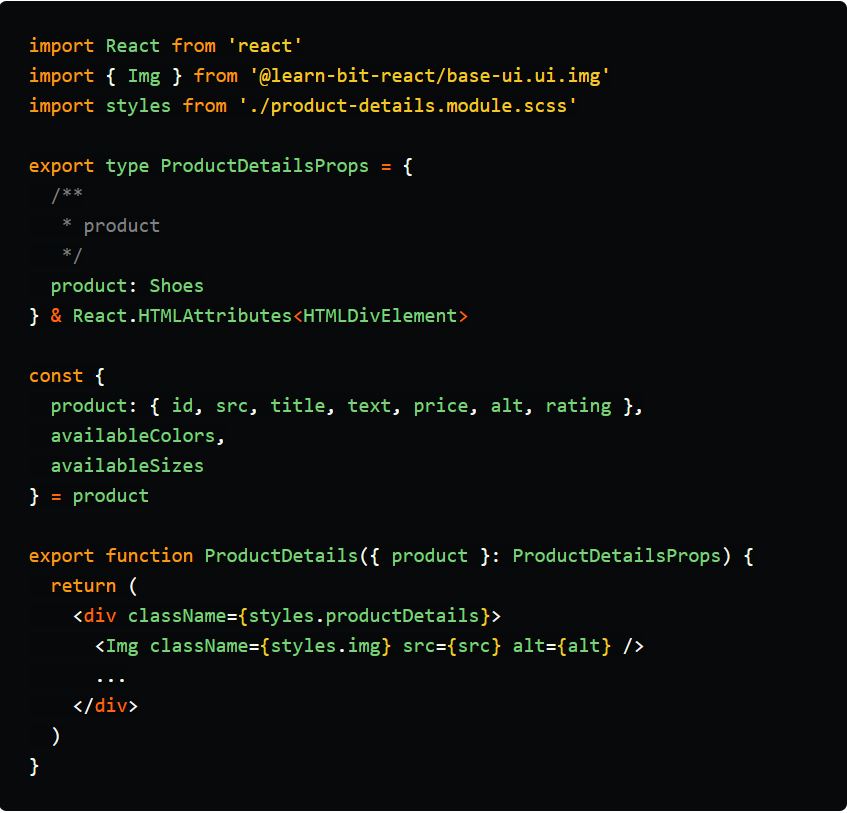
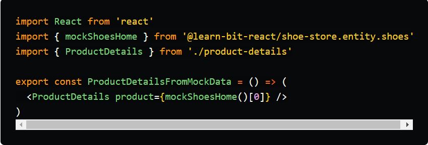
And in the composition file we can just import our mock data and use it directly:
Use whatever method works best when building the component depending on who you are working with etc.
Adding our Second Component
The next component we need is the heading component to show the name of the shoe. As we already have this component we can simply install it
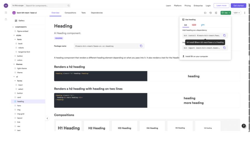
And then use it in the component.
 Building one of the new components
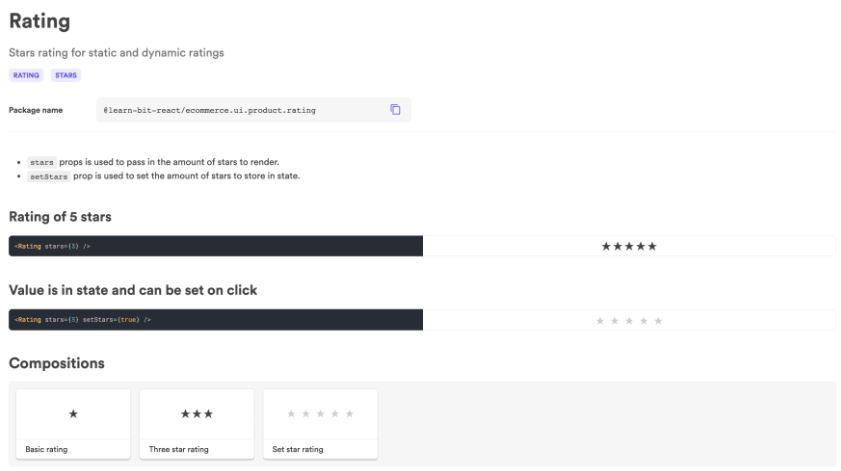
As we see our component taking shape the next component according to our design is one we do not have. This is where the process changes. We need a rating component and there are two things we can do here. We can go build the rating component or we can put a placeholder here and come back to build it later as maybe it might take more time, we might have to do more research or perhaps another member of the team is actually building it.
Personally, I used a placeholder so I could more or less get the product details component to look almost finished and then come back and work on the missing components that needed building.
To build the rating component I created the component in the ecommerce scope and started building it completely in isolation from the product details component. Once it was working how it should be, I then imported it into my product details component the same way I imported the Image and Heading component using the full package name and then used it in the product details component passing in the necessary values to the props to make it work.
The Finished Product
Once we have finished going through all components we should now have a very decent-looking product details component that now needs to make sure the mock data is working correctly and that it is styled as per the design. Of course, documenting the component is important so others know how to use the component and what props are available. Proving a live playground makes it much more fun for others to be able to test your component out. And of course, adding tests to your components are very important and should be added when possible. That is something I am still working on and trying to improve. With more testing knowledge this of course becomes much easier.
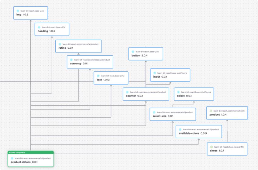
Dependency Graph
We now have a product details component with a dependency graph showing all the components we used as well as the name and scope of that component and its version. It is also easy to see which component depends on which such as the select-size component from the ecommerce scope which depends on the select component from the base-ui scope.
Adding our component to our page
Once the product details component is finished we can now import it into our product page and make sure it works at app level. There are a few extra things we have to do here such as apply route params to make sure we are showing the right product depending on the route.
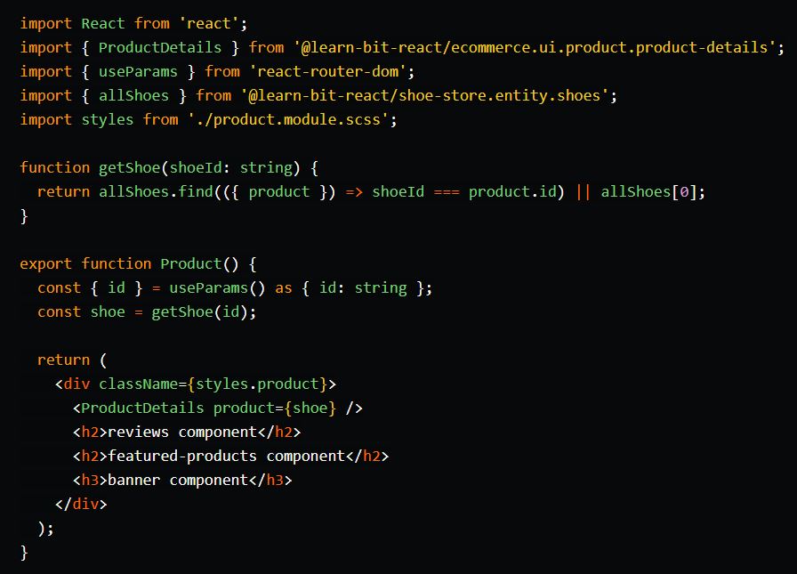 First we need to add our new route to our app with a dynamic id. In the app I use the React Router Routing Provider component that has been created by the Bit team.

I then import the component and wrap my routes in the routing Provider component.
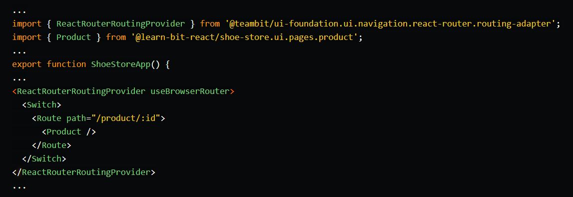 Routing in Bit Compositions
When working with Bit we need to take a few things into account when working on compositions. As we don’t have a browser router we don’t have access to params and therefore this page and the app will not work at composition level.
To fix this we need to work with the memory router from react router which we can import and then wrap our composition in it. We also need to add a routing provider. These components have already been created by teambit so we can go ahead and install them and then use them directly. This will allow our Link component from our product card to correctly link to the right product.
Our Link component uses the react router navigation link from teambit
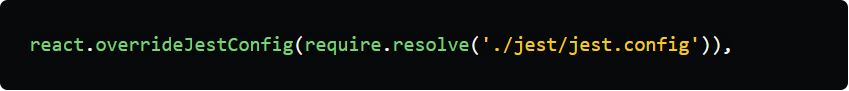
As this component is built with ESM there are a few things we need to do in order for it to work until we have better ESM support.
In our environment component’s runtime file we have to sure we are overriding the Jest config with our custom jest config.
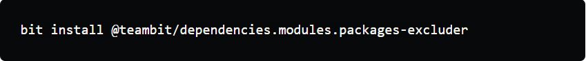
The custom Jest config should then ignore the components it needs to ignore. As we are requiring the packages excluder we will need to install it so we can use it.
We then exclude the packages we want to exclude which in our case is our link component and all teambits components.
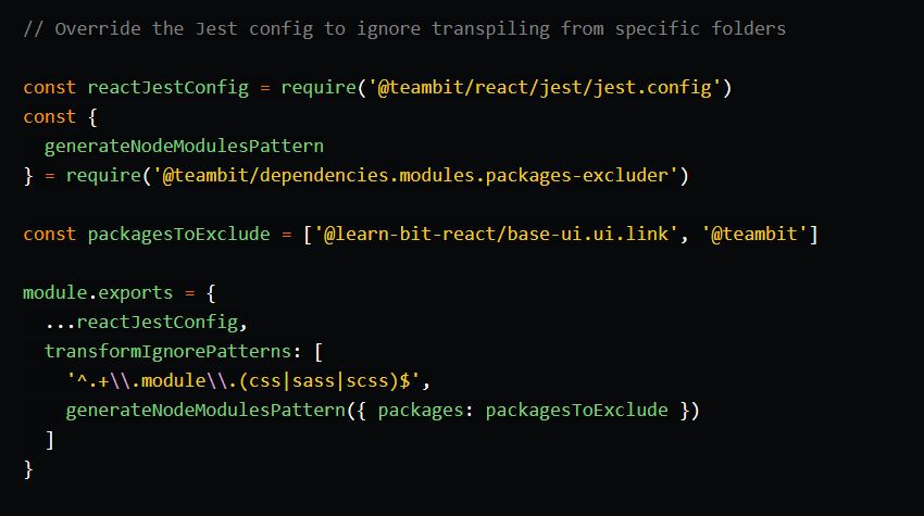
We can now use this component just like any other but we will not be able to write any tests for the link component as the test files will be ignored by Jest and it will just show up as if we have no tests even if you write them.
Conclusion
We can then continue to build the next component of this page which is the reviews component following the same workflow as we did above and so on until we have the page fully complete.
Of course our work is still not done here. We have only added the design component for the add to cart button and at the moment this is not going to add anything to a cart. For now it looks good and can pass the design inspection while we work on the next stage of the project. The cart page including the add to cart functionality.
After thoughts
Once I had built the product details page I then thought about what if I was to use this in the perfume store. The perfume store has no colors or sizes and therefore doesn’t need these components. In previous times I would have added an if else clause to this component so that if it received the data of color then render the available colors component else don’t render it.
But by doing this we are going into the building one component to suit many situations. Really we should look at the product component as something related to all products such as name, description, price etc and then add children so that we can build a shoe details component that uses the product details component but expands on it by adding in the shore specific components such as available size and color.
Again another way of doing this is to create a completely new component of shoe details and not use anything from the ecommerce which means everything can be positioned completely differently form the product details. This is of course building in case one day we want to change things and is probably not necessary at all so, for now, I prefer to go with the first option of extending the product details component by adding in the shoe-specific components only.
What it has been like to build this in Bit
We are all used to building things inside our application kinda like a monorepo where we have access to all components all the time. When working with Bit we are working in one workspace. I used the shoe store workspace. But I needed to build components that are part of a different scope, part of a different repo. When creating new components I can choose to which scope they belong to and when exporting them I can add a default scope to the variants section of the workspace for each directory.
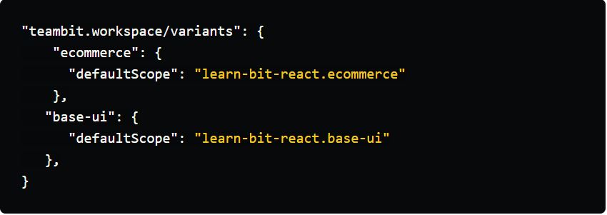
That means I can now build in one workspace yet also build components that belong to and will be exported to another scope. This means that if I don’t have enough people on my team I might end up having to manage more than one scope which is perfectly fine and so this gives me a better developer experience. When we import Bit components into other components we always use the full package name which means it is irrelevant if this component is in this workspace or not. The main thing we can’t change is the scope name which is used as part of the package name so therefore we need to think about names from the start.
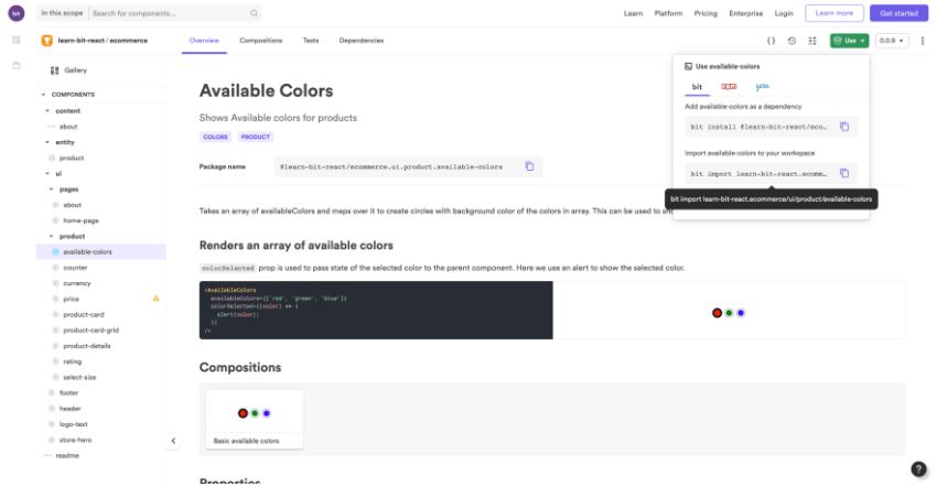
With Bit there is a cool feature called import which you can use to import any component into your workspace from another workspace should you want to modify them. This might be the case when wanting to improve the API of a component or even just a bug fix. For example, when building the available colors component I needed to make changes to it so that it would work with state and being able to just import it into my workspace and work on it without having to clone another repo, tag it and then export it made such a difference.
So what about your GitHub repo? GitHub is important for me to be able to go back in time incase something isn’t working that was working before. While building I pushed all components into the shoe store repo and once I have finished I can use the eject command from bit to eject the components that I do not want in this workspace and repo.
When someone wants to work on the ecommerce repo all they have to do is run the bit import command and they will get the new imported version of the available colors component that I already tagged and versioned. If there is any merge conflicts then they can be resolved just like you would with git. This workflow was different to how I would normally work. However once I saw that components were being exported to the right scope and could easily be imported to the correct workspace should another team member need to work on it, it really did feel like a nice way to work. I was able to build things quickly and not have to worry about cloning or linking.
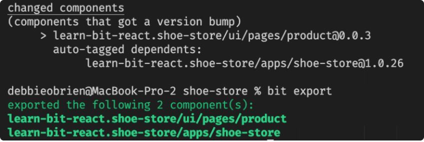
And of course, tagging becomes easy with Bit as it auto tags any dependents. Here by changing the product component the shoe store which uses the product page component also gets a new version, once of course all tests are passing and then running the export command will export both of these components. This means I can easily tag and export components without having to worry about updating components that use the changed component.
Demo Project
If you want to check out the demo project then here are some links:
- GitHub repo for ecommerce components
- Product Details component on Bit
- Base ui components on Bit
- Shoe store app and components on Bit
- Shoe store app deployed on Netlify